注意!
この記事はQiitaにて公開されていた内容をimportしたものです。
これらの内容は場合によっては陳腐化していて役に立たなくなっていたり、有害であったり、現在の著者の主張と異なることがあります。
皆様の判断の上でご利用いただけますと幸いです(度を超してヤバいものは著者に連絡して頂ければ対応します m(_ _)m)
はじめに
過去に書いたQiita記事「Android L Developer Previewで追加されたripple effectを使った独自ボタンを作る」があるのですが、Android 5.0 SDKの正式リリースがあったので、公式リファレンスを踏まえつつ別観点から解説していきたいと思います。
- 公式リファレンス: RippleDrawable | Android Developers
説明しないこと
JavaコードからRippleDrawableをアレコレするような内容には触れません。また、API21未満でRippleDrawableを使う方法にも触れません。むしろ俺が知りたい。
あしからず。
基本事項
RippleDrawableはLayerDrawableを継承しています。よって、通常のdrawableリソースと同じように使うことが出来ます。(この点が、後述する@android:id/maskの理解を助けることとなるでしょう。)
RippleDrawableの記述をしたxmlはres/drawable(下位互換性を考慮するならres/drawable-v21)に配置します。
今後のステップでは、以下のようにButtonを配置してあることを前提とします。
    <Button
        android:layout_width="match_parent"
        android:layout_height="wrap_content"
        android:text="リップルリップル!!!"
        android:layout_gravity="center_horizontal"/>
Step.1: 何も考えずにつかってみる。
上記layout.xmlの状態でも、通常のボタンとしてRippleエフェクトが発動します。
では、colorPrimaryなどのスタイル設定をせずにボタンのエフェクトカラーを変更するにはどうすればいいでしょうか?
ひとまずは何も考えずに以下のようにdrawableリソースを作ってみます。
<ripple xmlns:android="http://schemas.android.com/apk/res/android"
    android:color="#FFFF0000">
</ripple>
次に、Buttonのandroid:background上記xmlを指定します。具体的には:
    <Button
        android:layout_width="match_parent"
        android:layout_height="wrap_content"
        android:text="リップルリップル!!!"
        android:background="@drawable/background_button"
        android:layout_gravity="center_horizontal"/>
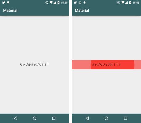
すると、以下のようになります。

境界線をはみ出しています!なんだこれは!!!!! 実は、リファレンスにも記載があるのですが、RippleDrawable内に子要素を持たない場合、境界線を無視したエフェクト描画を行います。これは正常な動作です。
Step.2: RippleDrawableの子要素に色を与えてみる
次に、以下のようにdrawableリソースを編集してみます。
<ripple xmlns:android="http://schemas.android.com/apk/res/android"
    android:color="#FFFF0000">
    <item android:drawable="@android:color/holo_green_dark" />
</ripple>
RippleDrawableの要素内に、子要素itemを記述し、属性としてdrawableを付与します。このdrawableはcolorでも9patchでもOKですが、#FF00FF00と書くとエラーとなります。Colorリソースとして一旦定義してやるとOKです。

(本来のButtonのbackgroundを置き換えているので、ボタン枠ではなくなったものの)思ったような感じのエフェクトとなっているはずです。
ripple要素内のitem要素で定義した色(この場合@android:color/holo_green_dark)がデフォルトの色となります。ボタンを押すとitemの色とrippleのcolorで定義した色が混ざった色が広がり、最後にrippleのcolorで満たされていく、という具合です。
なんとなく察しがつくと思いますが、itemに定義したものを基準にRippleエフェクトをかけるので、itemに9patchを定義したりすれば様々な形のボタンでRippleエフェクトを堪能できるということです。このあたりは以前書いた記事を参照して下さい。
ところで、2点困ったことがあります。
ripple内のitemに記述した色定義には@android:color/transparentは使えません。定義すると、Rippleエフェクトが発生しなくなります。何故だ・・・。通常状態で背景色を描画しないボタンを使いたい時はどうすればいいでしょうか?
もうひとつは、ListViewではセルをクリックしたあと、ripple内のitemに定義した色が残り続けるという問題が発生します。となるとtransparentを定義したいですが、上記のとおり使用できません。
Step.3: @android:id/maskを活用する
困ったことを解決するために、ひとまず以下のように書き換えてみてください。
<ripple xmlns:android="http://schemas.android.com/apk/res/android"
    android:color="#FFFF0000">
    <item android:id="@android:id/mask" android:drawable="@android:color/white" />
</ripple>
こんな感じになります。いいですね。具体的にどういう仕組みになっているのかはJava力低いので別途解説を待ちたいですが、RippleDrawable.javaを読む限りでは、maskというレイヤーを追加して表現しているように見えます。影響範囲がmaskレイヤー内で完結するので、ListViewのセルの背景色が残り続ける問題にも対応できます。素晴らしい。
応用: 既存アプリのボタンのRipple対応について
様々なケースがあると思うのですが、よくあるのは「タップしたら背景色が変化する」というもので、おそらくは以下のように定義されているのではないでしょうか。
<?xml version="1.0" encoding="utf-8"?>

<selector xmlns:android="http://schemas.android.com/apk/res/android">
    <item android:drawable="@color/MainColor.Focused"
          android:state_pressed="true"/>
    <item android:drawable="@color/MainColor"
          android:state_pressed="false"/>
</selector>
これをRippleエフェクト対応するには、以下のファイルをdrawable-v21に配置します。
<?xml version="1.0" encoding="utf-8"?>

<ripple
    xmlns:android="http://schemas.android.com/apk/res/android"
    android:color="@color/MainColor.Focused">
    <item android:drawable="@color/MainColor"/>
</ripple>
おまけ: デフォルトのボタンの定義
この情報は2014/10/22現在のandroid-21なsdkから確認しました。
    <!-- Bordered ink button -->
    <style name="Widget.Material.Button">
        <item name="background">@drawable/btn_default_material</item>
        <item name="textAppearance">?attr/textAppearanceButton</item>
        <item name="minHeight">48dip</item>
        <item name="minWidth">88dip</item>
        <item name="stateListAnimator">@anim/button_state_list_anim_material</item>
        <item name="focusable">true</item>
        <item name="clickable">true</item>
        <item name="gravity">center_vertical|center_horizontal</item>
    </style>
<?xml version="1.0" encoding="utf-8"?>
<!-- Copyright (C) 2014 The Android Open Source Project

     Licensed under the Apache License, Version 2.0 (the "License");
     you may not use this file except in compliance with the License.
     You may obtain a copy of the License at

          http://www.apache.org/licenses/LICENSE-2.0

     Unless required by applicable law or agreed to in writing, software
     distributed under the License is distributed on an "AS IS" BASIS,
     WITHOUT WARRANTIES OR CONDITIONS OF ANY KIND, either express or implied.
     See the License for the specific language governing permissions and
     limitations under the License.
-->

<ripple xmlns:android="http://schemas.android.com/apk/res/android"
        android:color="?attr/colorControlHighlight">
    <item android:drawable="@drawable/btn_default_mtrl_shape" />
</ripple>
<?xml version="1.0" encoding="utf-8"?>
<!-- Copyright (C) 2014 The Android Open Source Project

     Licensed under the Apache License, Version 2.0 (the "License");
     you may not use this file except in compliance with the License.
     You may obtain a copy of the License at

          http://www.apache.org/licenses/LICENSE-2.0

     Unless required by applicable law or agreed to in writing, software
     distributed under the License is distributed on an "AS IS" BASIS,
     WITHOUT WARRANTIES OR CONDITIONS OF ANY KIND, either express or implied.
     See the License for the specific language governing permissions and
     limitations under the License.
-->

<!-- Used as the canonical button shape. -->

<inset xmlns:android="http://schemas.android.com/apk/res/android"
       android:insetLeft="@dimen/button_inset_horizontal_material"
       android:insetTop="@dimen/button_inset_vertical_material"
       android:insetRight="@dimen/button_inset_horizontal_material"
       android:insetBottom="@dimen/button_inset_vertical_material">
    <shape android:shape="rectangle">
        <corners android:radius="@dimen/control_corner_material" />
        <solid android:color="?attr/colorButtonNormal" />
        <padding android:left="@dimen/button_padding_horizontal_material"
                 android:top="@dimen/button_padding_vertical_material"
                 android:right="@dimen/button_padding_horizontal_material"
                 android:bottom="@dimen/button_padding_vertical_material" />
    </shape>
</inset>
(余談ですが、appcompat-v7とかも確認してみると面白いかもしれませんね。もしかしたらbtn_default_mtrl_shapeが画像で定義されてるかもしれません。未確認ですが。。。)